COLORS
PURE PORCELAIN
In a Spectrum of Shades
COLOR IN A CLASS OF ITS OWN
Recognized by the New York Times for her “surprising rainbow of colors,” artist Mary Anne Davis works with custom white clay, specifically designed to bring out the chromatic purity that’s achievable with porcelain. Her hand slip casting method creates subtle variations that surface on each dish, drawing out the nuances within a range of ceramic glazes. A canvas for luminous color, the glazes highlight each individual surface, like sun on water. All davistudio glazes are certified food safe and lead free, meeting the labeling standards of proposition 65, the highest standards for ceramic glaze labeling.
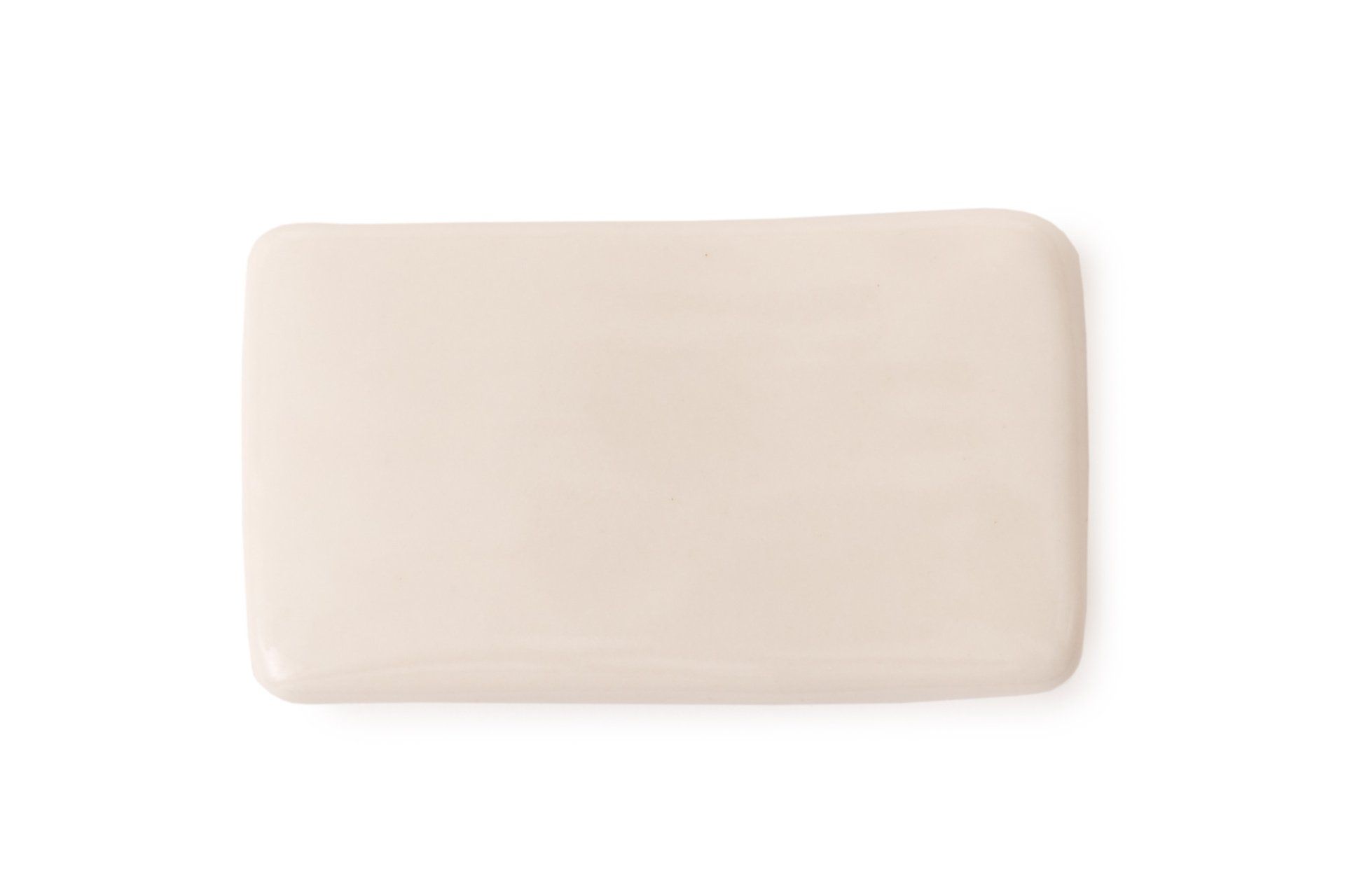
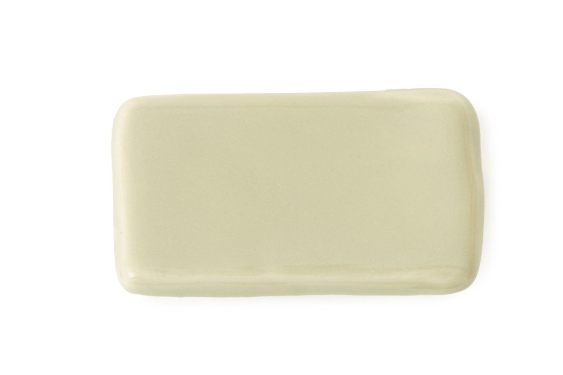
WHITE
Warm, soft and slightly removed from a pure white, this is our most popular shade. It has the translucency of a nautilus shell.
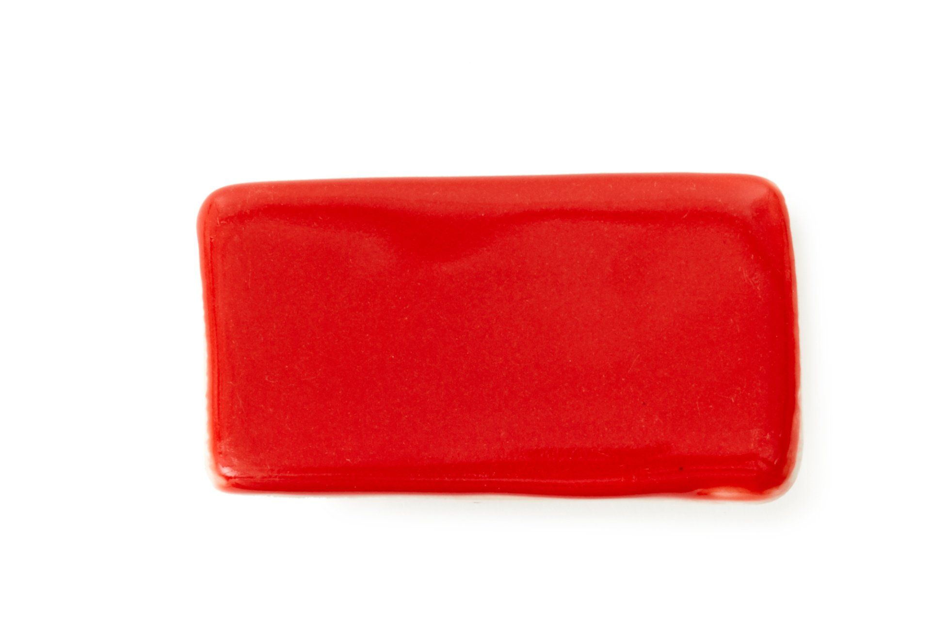
RED
This rich, clean red has an expressionistic quality that calls to mind Mark Rothko's color field paintings or Georgia O'Keeffe's poppies.
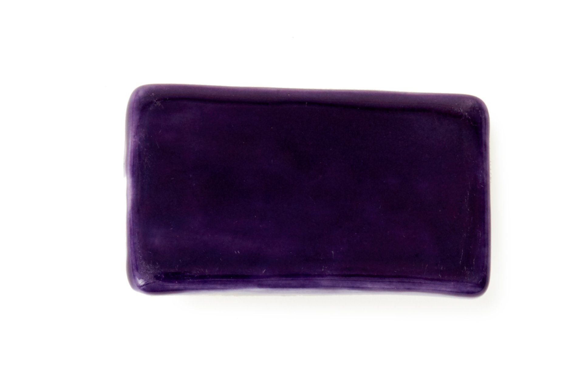
PURPLE
Our purple evenly balances blue and red tones for a sophisticated, subtly dappled surface that's reminiscent of Monet's waterlilies.
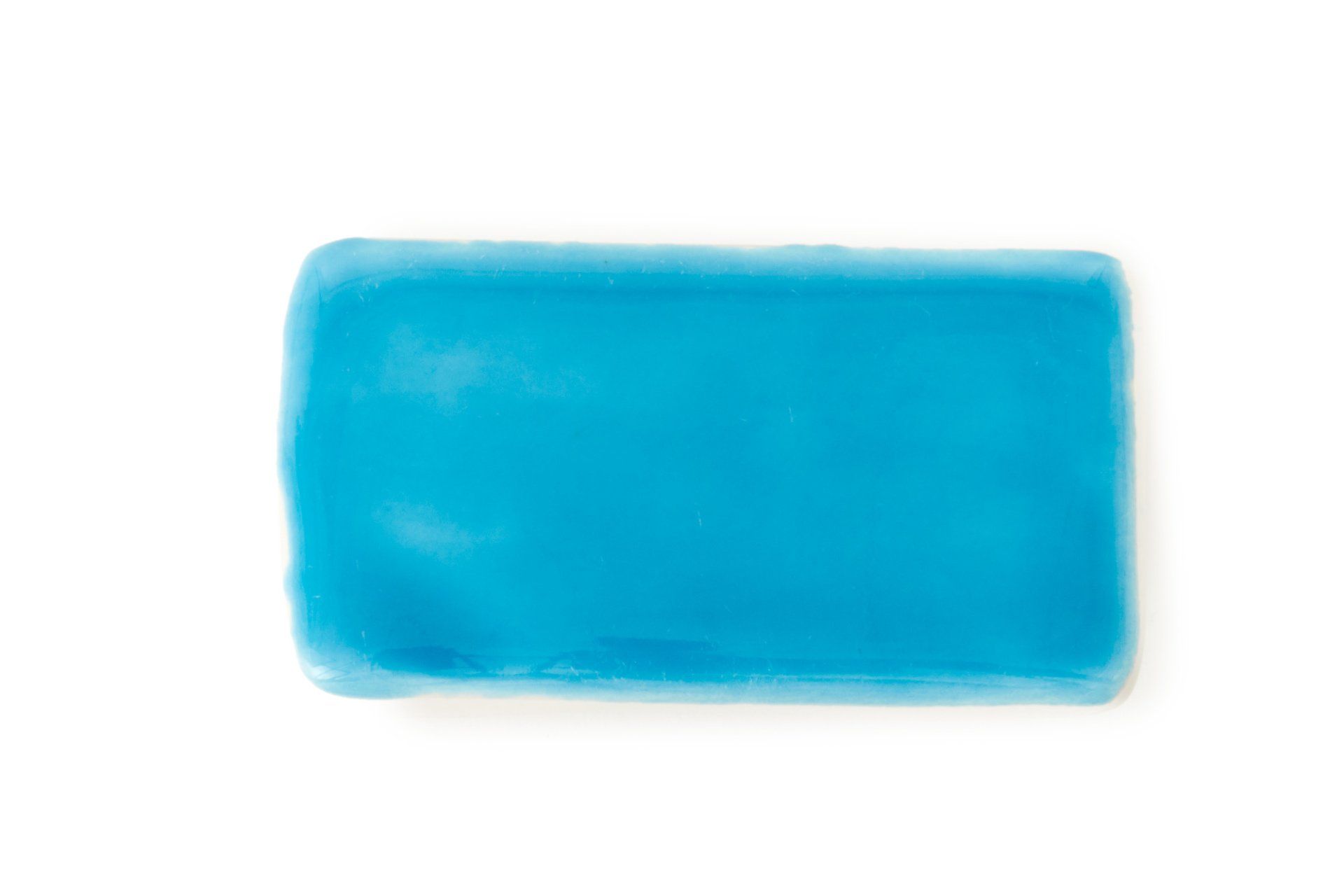
LIGHT BLUE
Cornflower blue was a favorite of the Dutch painter Johannes Vermeer. Here, it lends a light, soft touch that feels barely brushed onto the surface.
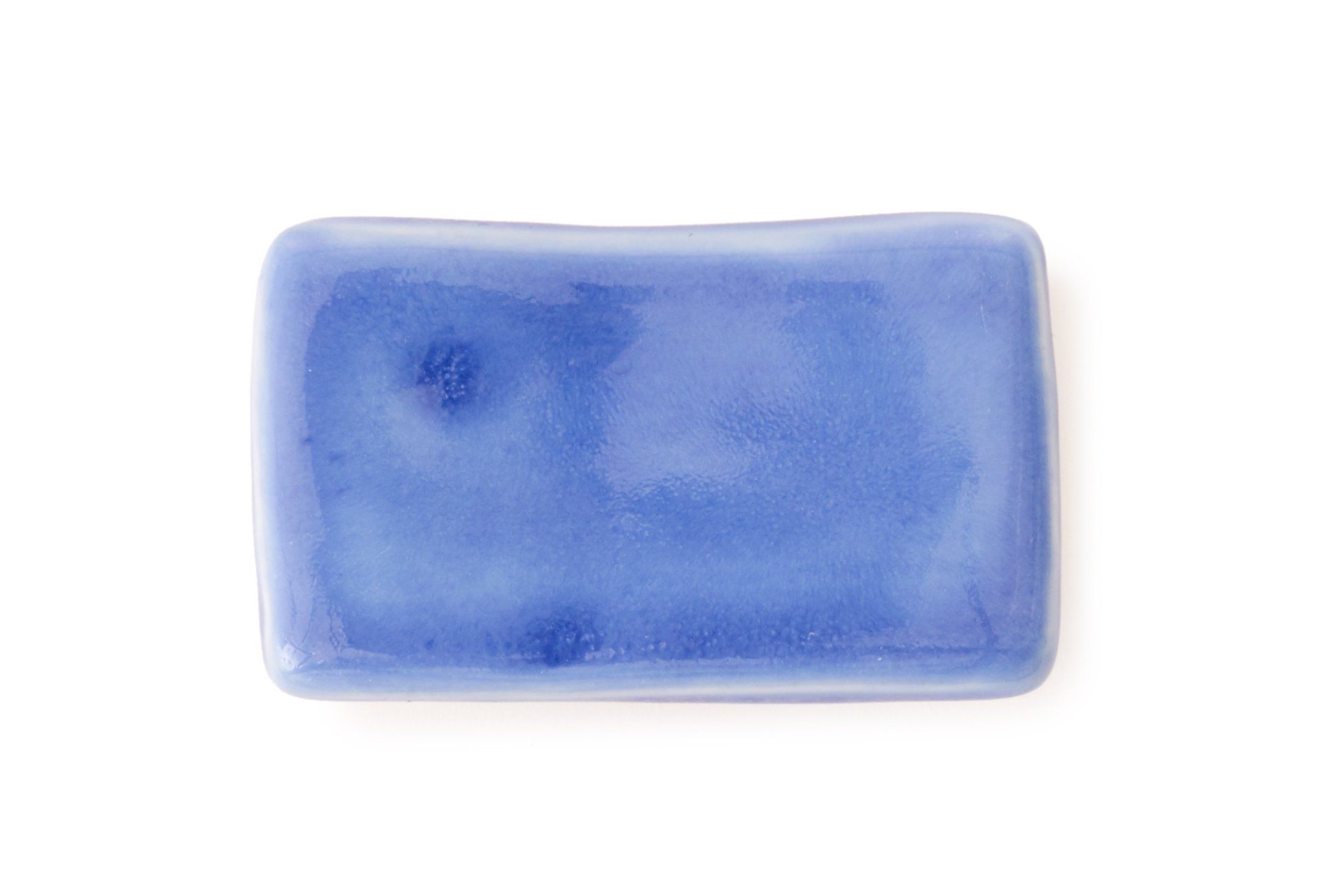
PERIWINKLE
This shade is our interpretation of the blue hour, a time favored by painters when indirect sunlight makes the sky appear blue-violet at twilight.
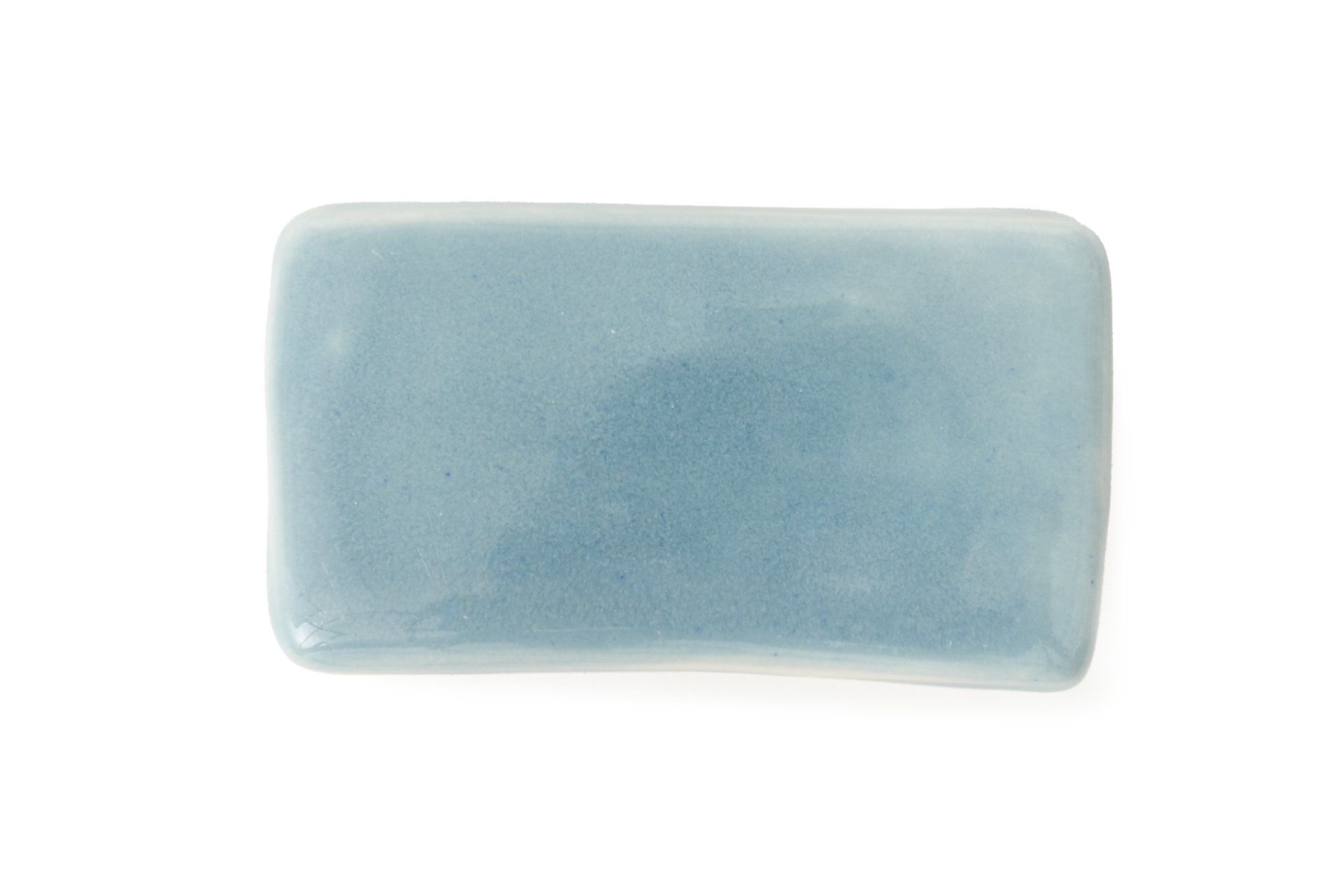
ICEBERG
This cool, arctic blue is named for the colored light that cascades through layers of glacial ice. Soft and pale, it pairs well with grays and whites.
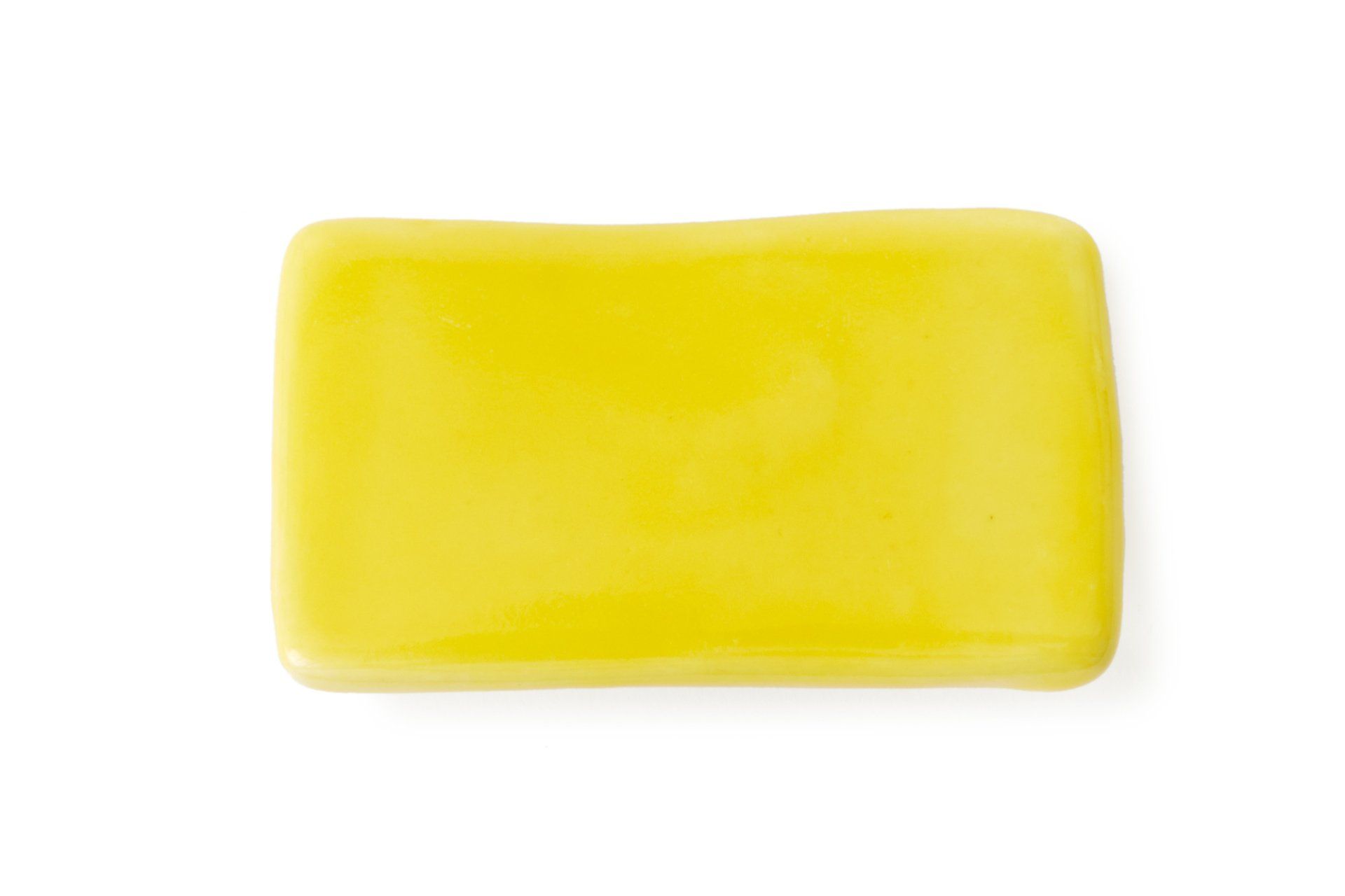
YELLOW
Like light streaming into a sunny room, this pale, painterly yellow is the color of lemon custard or daffodils.
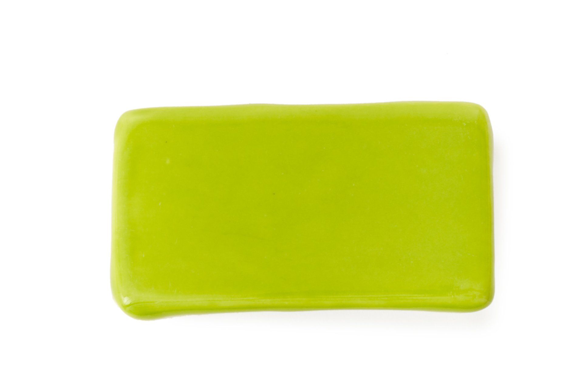
LIME
This lively, stippled shade conjures the effervescence of early summer, tropical sunlight and a splash of citrus.
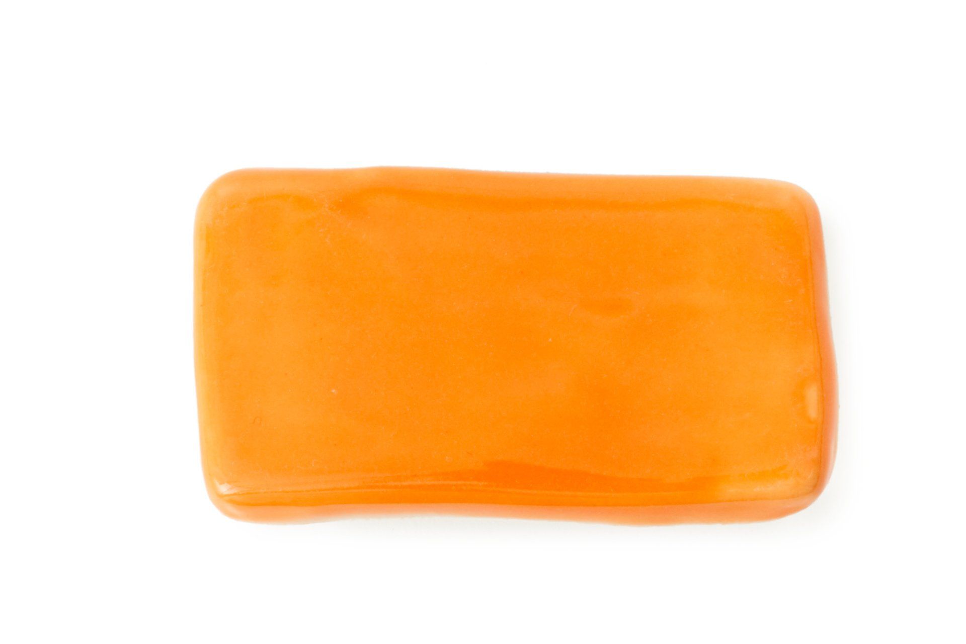
ORANGE
The color of marigolds and mandarins, this hand-painted shade boldly brings happiness to the table year-round.
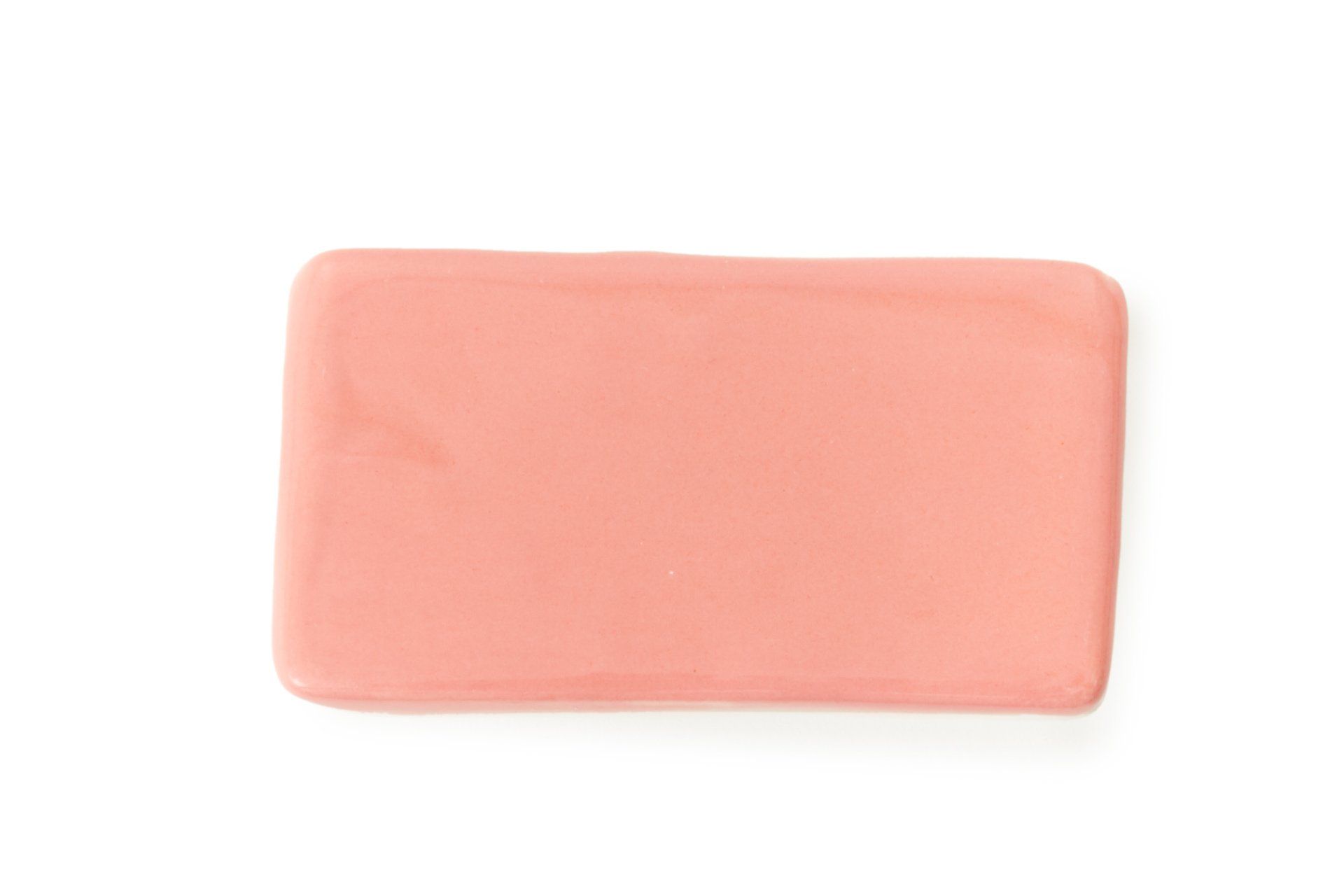
PINK
A fresh pastel that calls to mind pastries and rose-colored confections, this warm pink charms and uplifts.
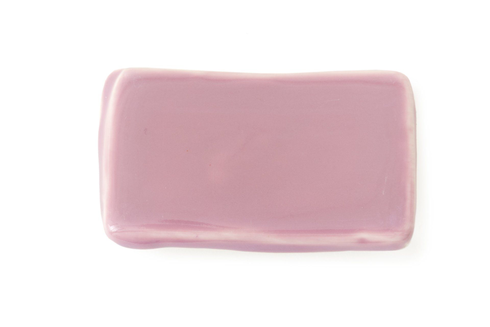
MAUVE
Romantic and muted, this dusky shade has the soft, color-stained feel of a Helen Frankenthaler painting.
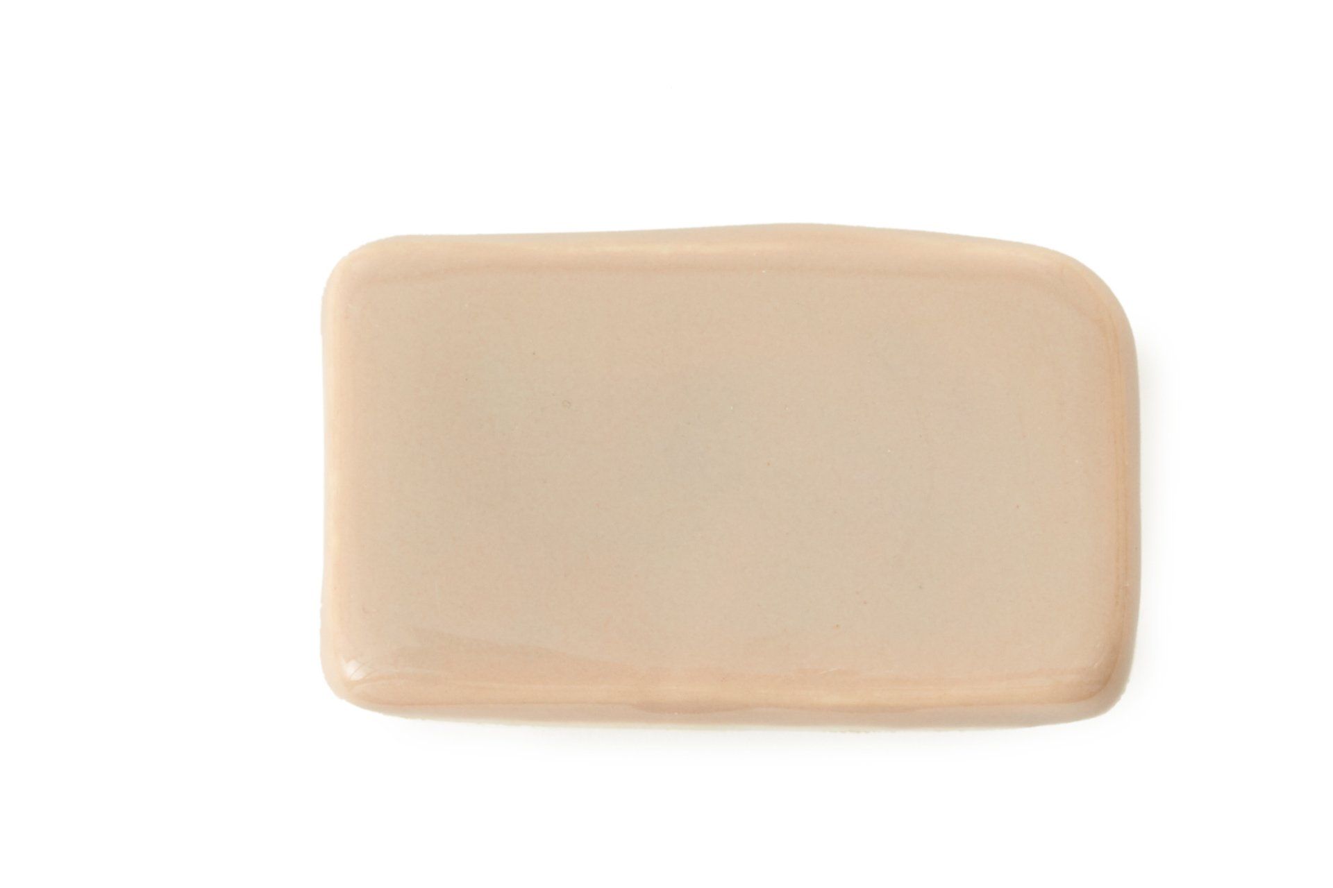
TAUPE
An earthy neutral, our taupe evokes raw clay or natural stone. It's a versatile shade that layers easily with other colors.
MINT
Soft tints give this pale green a clean, calm look that still feels cheerful, especially when set with white on a spring table.
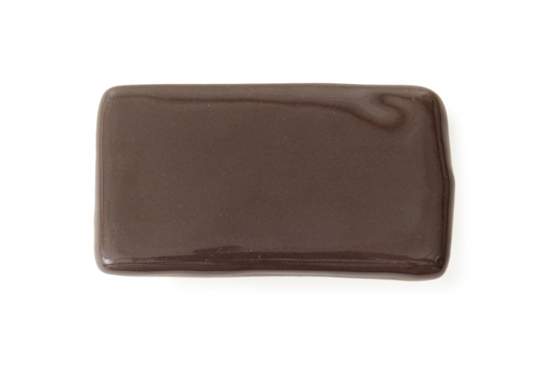
CHARCOAL
Layered with warm undertones, our charcoal reads as a graphite gray or deep smoky brown, depending on the light.